Trimester 2 - Project Development
- Julia Toczyska
- Jan 17, 2024
- 4 min read

Updated: Apr 21, 2024
At the beginning of this trimester, we got introduced to Adobe XD. We did many simple exercises which helped us familiarise ourselves with what this program has to offer.

Design System PowerPoint
Experiments
I first began by transferring my previous design done in Photoshop onto my newly created XD file. I found this process quite simple, all I had to do is export my layers one by one as a PNG, save it onto a newly created folder on my desktop, and then import these onto the XD file. Once that was done, it was simply the matter of rearranging everything to its original place.
Once I got everything in place, I began the experimenting process. One of my favourite features of XD is it's ability to animate almost anything, making images and text appear on the site from almost out of nowhere. As soon as I got to experiment, I have decided to add some additional animations, for example, animating images I have featured on the home page.

For this animation, all I had to do is; group the components, then duplicate the whole page. Once duplicated, I have moved all the images off the first page to the direction I want them moving from, and then linked both pages.
I have set the trigger for the animation into a timed one, meaning the animation would activate itself after a certain amount of time - in this case I have set it to one second, meaning that the animation will be almost instant.
Redesign
Whilst playing around with Adobe XD's features, I have realised that some of the features I have initially imagined for my website won't work as well as intended. One of the most prominent features that I haven't thought through well enough previously is the navigation bar, or rather the lack of it... Looking at it now, it feels quite clunky and unappealing. I have decided to redesign it into buttons, that not only take up the space much better, but also are much more noticeable - which is great!

Whilst being in the spirit to redesign things, I have additionally changed the chat box feature into a similar button shaped style, which allowed the site to be much more consistent. Additionally, I have changed the background of my website from the boring black into a nice black and white gradient, which I believe is a lot nicer to look at. After the redesign, I have repeated the same animation I have done above.
Animating The Chat Box
Once I was done with the home page, I began working on the chat box animation. Since I have converted the chat box into a button feature, it meant that I also had to redesign the fully opened chat box!

I have decided to keep the design quite simple. I have also used a similar gradient to the one I have used in the background as I believe it makes it look more interesting.
After that, all I had to do is duplicate my home page again, and position the new chat box design on the desired spot on the new page. Then, I just simply linked the chat button to the 'x' of the chat box on the next page. Trigger this time was set to 'tap'.

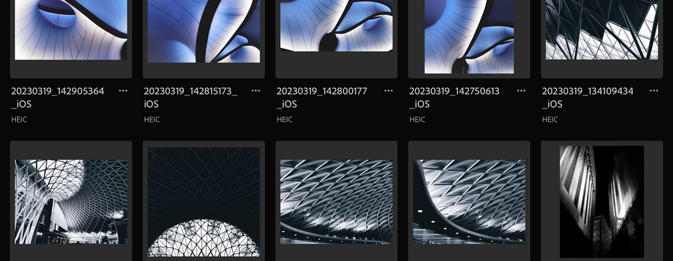
Photographs


Pages
As I began working on additional pages, once again, I realised that I wasn't as satisfied with my original idea. I found it silly that I only designed one more additional page where my navigation has links to all kinds of pages. So... there was only one solution to this problem. I have decided to do 4 pages, including home page, about us page, projects page, and a contact us page. Each page features a completely new design, using photographs I have taken myself. I have once again edited my photographs in Adobe Lightroom as it is my favourite program for photograph correction.


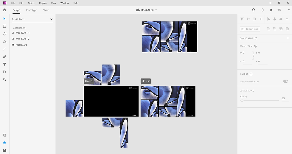
Adobe XD Navigation

When I got to the page animation part, it was quite simple, I have repeated the animations I have done for the home page to all of the other pages for consistency. I also made sure that each new page created was connected to every other page in the file.
Final Desktop Design
Mobile Redesign
Whilst Redesigning my website I have also update my mobile design to fit with the new theme. It didn't change much apart from the chat box, which I decided to make wider as I believe it would be more comfortable to use on a mobile screen.

Evaluation
Overall, I am highly satisfied with my project! I managed to make a lot of progress and create a website that I am highly satisfied with. I found Adobe XD to be a challenging program as I had barely any experience with it, but once I got the hang of it, everything went smoothly. I only wish I got to animating the mobile design too! Maybe that is something I could come back to in the future? Regardless, I believe I managed to achieve my initial goal of creating a virtual gallery.

Comments