Trimester 1 - Project Diary
- Julia Toczyska
- Sep 27, 2023
- 5 min read

Updated: Dec 12, 2023
Initial Response To The Brief
Trimester 1 focuses entirely on creating digital content that will be used to populate a website.
Topics will include:
• Photography • Social media content • Animation • Audio • Video
Our project came with the title "The World I Share" which can be interpreted in various ways. To me this title can be described in a single word, appreciation. During this projects, I aim to develop a site which will look at our world from the outside point of view. I will explore themes of the past, present, and maybe potential future, with the emphasis on how far the humanity has come, how much our world has changed. Have we stopped appreciating our past?
My website will include virtural chatrooms which will allow users to further discuss issues proposed as well as analise pictures on the website - virtual gallery.
Below I have attached a picture of my initial written response to the brief.

Taking photographs for my site
During my first photoshoot I was not exactly certain on what I aim to achieve, however, one thing I knew for certain is that I wish to create abstract and aesthetically pleasing photographs. I took a lot of inspiration from my previous photography works from A level and decided to search for various shapes and dynamic angles that I could capture and later experiment with in photoshop.

Editing with photoshop
We started one of our lectures with exploring Photoshops features. We were tasked with creating a experimental home page for our website. Through the use of overlaying images on top of another I managed to achieve a abstract look that I was highly satisfied with.


While playing around with my image, I have decided to go for a black and white theme. I believe that helped my scenery merge together into one.
After I was done with my image, I have decided to add a bit of text. Initially I intended to only have one word in yellow to stand out from the rest of the image, however, my lecturer suggested that I should also overlay the text as it would add a bit of depth to it. I really enjoyed the contrast between the neon yellow and the deep blue.
London exhibition shoot


In my spare time I managed to visit the Science Museum in London, which I saw as the perfect opportunity to take some photographs. One exhibition that really caught my attention is the Mathematics: The Winton Gallery designed by Zaha Hadid, who also happens to be one of my favourite architectural designers. Her work always inspired me to push my creativity further.
Editing in Adobe Lightroom


This is a brief showcase of how I have edited my photographs in Adobe Lightroom. I have additionally cropped and manipulated images using the distort tool later on in photoshop to fit my desired dimentions.
Colour palettes

Whilst choosing the colour scheme for my projects I have considered a varying colour combinations. I have explored many muted earthy tones such as brown and creme, however, I have found them looking quite bland when put together.
Sincne I want my website to be a virtual gallery I fugured I should use flashy colours that will attract users, at the same time I do not want my colour scheme to look too busy and overwhelming.
I was leaning towards blue tones whilst making my final decision. I believe both of the right colour schemes work best for what I am trying to achieve. I believe I will use the bottom right one, it has a good balance between dark and bringht tones.
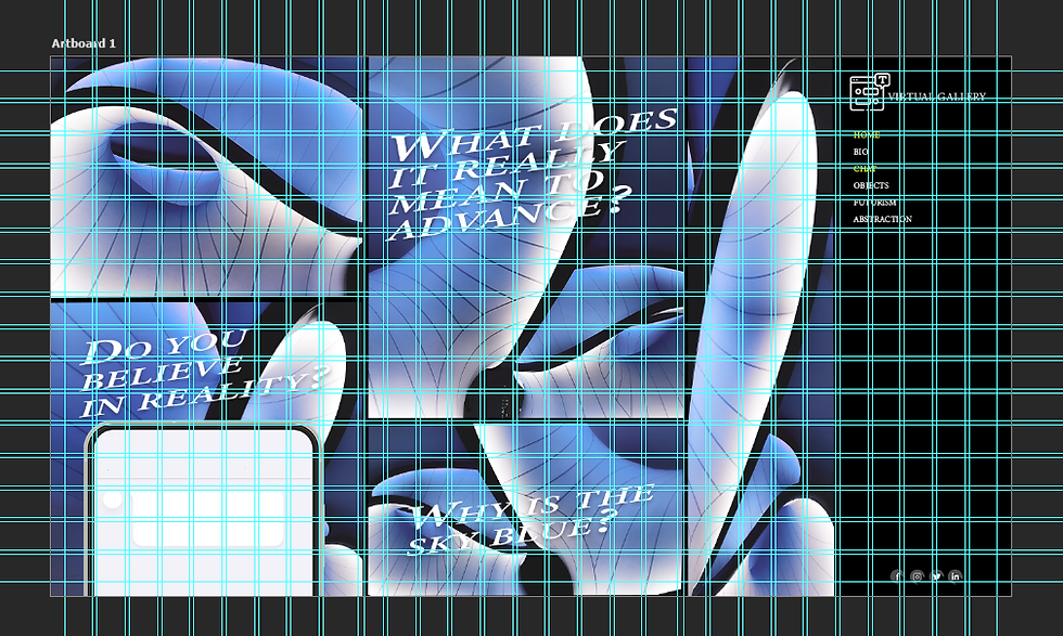
Home page layout
Take One

My initial design for the website included the photographs I took few weeks ago during our first lectures. I really enjoyed the conbination of photographs used as the main image on the home page, however, looking back at it I feel like it looks a bit too busy. What I enjoy about design is the beauty in simplicity and minimalism. So that's why I ended up redoing the whole home page, which can be seen down below.
Take Two


I am highly satisfied with my redesign. I really enjoy the blue colour scheme, as I believe it complements my photographs well. I have decided to include small question promps on my home page which users can reply to using the chat function or by clicking on the phone present in the left bottom corder. The site also features a navigation bar at the right side which consists of various hyperlinks, as well as a simple logo design at the top.
While creating an image for the second page I have decided to try the AI generation tool in photoshop and used that to transform my photographs into abstract flowers. I find AI works quite controversial, chence why I wasnt exactnly sure if I want to be using the AI feature at all, but at the same time I believe this is an excellent topic I might want to bring up in this project (that is someting I will discuss in the near future).
Photoshop animation test
This is my first animation attempt I have ever done. It used simple geometrical shapes and photoshops timeline. I have keyframed the shapes to move across the artboard, which can be seen down below. This is a useful feature that I can see myself experimenting with in the future.

After Effects animation test
Simple Animation test which uses After Effects background and text animation features.

Website Animation in Photoshop
This is a proper animation I have done for my website. It showcases the chat feature - when a user hoovers over the mobile phone at the bottom left corner it pops up sligtly. The user has to actually click on it to open the chat fully. Users can also access the chat function from the navigation bar on the right if they prefer to do so.
Mobile design

For my mobile design I have once again gone for the minimalistic aesthetic. One thing that really bothered me while designing the mobile counterpart for my website is the chat function - why would I feature another phone inside of an actual phone? This is something I haven't throught about while designing. I have amanged to overcome that slight issue by making the chat box very simple, and I am glad I did that since it doesn't take away from the design nor does it look out of place.
I have decided to position the navigation bar at the top this time as it makes more sense with the mobile resolution. Additionally, instead of having all the hyperlinks written down on the page, I have added a drop down menu which exctends once being tapped - this helps my design appear a lot more clean and easy to follow.

Comments