Week 1/2 - Pilot Project One
- Julia Toczyska
- Oct 10, 2025
- 12 min read

Updated: Jan 17
As a third-year Digital Media student, I was challenged to complete a short pilot project over a two-week period. For this project, I chose to focus on animation, an area I have always been passionate about but haven’t yet explored in depth. Through this process, I aimed to push my creative boundaries and build confidence in an unfamiliar medium. Hope you enjoy my creative process!
Project Proposal

For my first pilot project, I decided to create a 15-second promotional animation for Hollow Knight: Silksong, using a combination of frame by frame animation and Adobe After Effects.
I chose this subject because Hollow Knight: Silksong is a project I deeply admire. It was developed by a small team of just three people yet has gained high anticipation over the past seven years. The dedication, artistry, and love poured into the game truly inspire me. Its passionate community has created a wave of fan content surrounding its release, and I wanted to contribute to that excitement in my own way. Although I haven’t had the chance to play the game myself yet due to my current workload, I decided to channel my admiration into producing an animation that celebrates and promotes such an inspiring piece of digital art.
Target Audience
The target audience for my animation is fans of Hollow Knight and the wider indie/souls-like gaming community. This includes both long-time followers who have been anticipating Silksong for years, as well as new players drawn to its unique art style, atmosphere, and storytelling.
I chose to create a short, 15-second animation in a "TikTok-style" format as this type of content aligns with how modern audiences, particularly younger gamers, engage with media online. Short, visually striking clips are highly shareable across platforms such as TikTok, Instagram, and YouTube Shorts, making them an effective way to capture attention quickly and generate excitement within the community.
Planning
Before beginning the pilot project, we were encouraged to follow a SCRUM style workflow to help plan, organise, and track progress efficiently. SCRUM is an agile project management framework that focuses on breaking work into smaller, manageable tasks and reviewing progress regularly.

Using the provided Miro template, I organised my project into different stages of production. I began by outlining my main objectives and tasks based on the project brief, then added digital sticky notes representing each individual task.
As I worked, I moved these notes from To Do ➔ In Progress ➔ Done sections, visually tracking my progress and maintaining focus on short, achievable goals.
This system helped me manage my time effectively across the two-week period, stay organised, and ensure that each stage of production from concept development to final animation was executed.
Moodboarding
Moodboarding played a crucial role in the early development of my project, helping me to visually define the art style, tone, and atmosphere I wanted to achieve. From the very beginning, I knew that I wanted the animation to focus on Hornet, the protagonist of Hollow Knight: Silksong, as she embodies the spirit of the games world.
To guide my creative direction, I created a dedicated Pinterest board filled with Silksong fan art, concept designs, and stylistic inspirations. This collection helped me identify the key visual elements, such as colour palettes, lighting, and character design, that would best capture the look and feel of the game as well as its community.

Throughout this process, I explored several creative ideas for the animation including:
A still scene with butterflies drifting through the frame
Hornet turning 180° to face the viewer
A sequence of her falling through a captivating landscape
Jumping and revealing her wings
Her cape transforming into a rose
These explorations allowed me to experiment with different moods, movements, and narratives before deciding on my final concept.
Concept
15-second animation focused on Hornet, the protagonist of Hollow Knight: Silksong
Opens in Moss Grotto, the first area from the game where Hornet begins her journey
Hornet turns as the camera pans out to reveal her weapon, the needle
The needle shines, followed by a sharp cut to the title screen inspired by the official trailer
Designed for short-form platforms like TikTok or Instagram
Although I bounced between different ideas throughout this blog post, this concept represents the final version I executed. In the end, I chose this structure for multiple reasons: Setting in Moss Grotto grounds the animation within Silksong’s lore, as well as presents the scene as the beginning of her journey. The reveal of Hornet’s needle symbolises her strength and determination, which are the key traits that define her character. This structure, combined with the short runtime, mirrors the pacing and tension of official promotional material, making it engaging and shareable for the Hollow Knight community.
Story Boards
Despite taking a slightly different turn, I still want to emphasise the importance that storyboards had in my project. I went through multiple iterations, but as I began production, I changed my mind to rely more on After Effects animation rather than frame by frame.
As much as I love frame by frame animation, it was simply not efficient for a 2-week time period. As for the storyboards, they shaped my vision as I went along and allowed me to try out different ideas despite being very rough.

With the storyboard locked in, it was time to move into the frame by frame and After Effects phase.
Frame by Frame Animation
I began the asset creation process by sketching Hornet to establish the overall art style and visual direction I wanted for the animation. By that point, I knew I wanted to animate her turning around, so I began by focusing on the motion of her cape as a foundation.
To achieve realistic movement, I studied several reference videos on fabric animation, particularly a tutorial RTFX animation on the principles of wave motion, which helped me understand the flow and movement of the material.
Once the base animation for the cape was complete, I refined Hornet’s proportions and body movement. To do so, I used a 3D model from Sketchfab as reference for angles and consistency, which strongly influenced my overall art style.

Finally, I added the legs, the simplest element of the sequence, requiring around 5 drawings to complete. Layering each component (cape, head, and legs) allowed me to create a smooth, cohesive motion while staying true to the character’s design and personality.
Colour Palette
As I moved onto colouring, I developed a custom palette. Initially, I took colours directly from Hornet’s official artwork, however, later on I adjusted the colours to fit the scenery I had in mind for the animation, considering lighting and the environment.

Flat colours

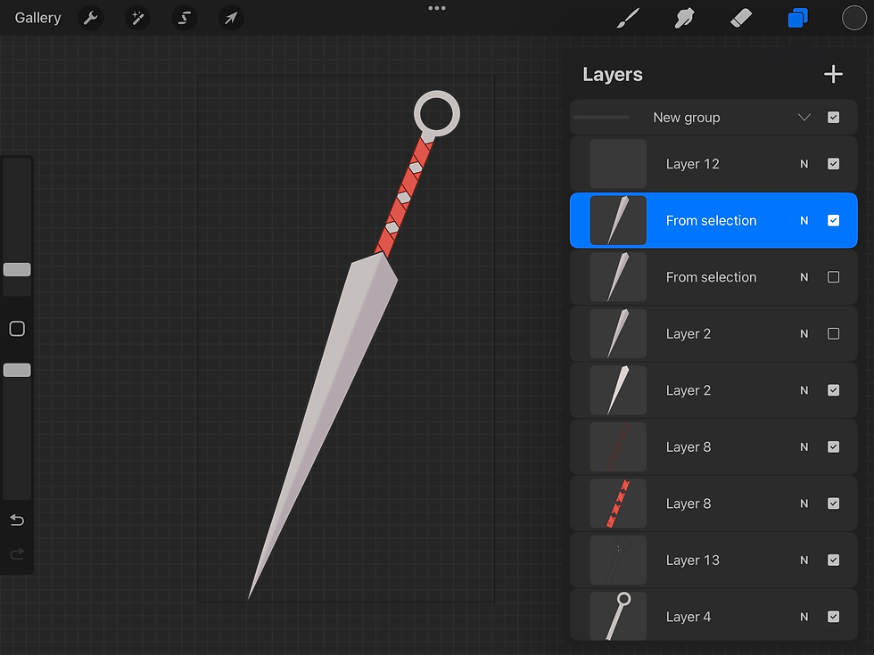
The Needle
Whilst sketching the needle I have envisioned for the animation, I found myself struggling with its design. I really missed the touches of red present in Hornets design, so while searching for inspiration, I came across a beautiful redesign by the user @H_omiu on X.
Their detailed design is beyond stunning, and if I had more time, I probably would've added more detail. However, given the short timeframe, I decided to keep it simple as I was eager to crack on with the animation phase as soon as possible.


I must admit, although I enjoy drawing as a hobby, I have never professionally rendered artworks before. For the purpose of this animation, I prioritised movement and animation over detailed rendering, knowing I wouldn’t have time to fully flesh out each drawing. With that being said, I am pleased with the final outcome of my assets, that including both the needle and Hornet herself. They serve their purpose more than well enough.
Thread Animation Concept
Initially, I had two ideas for the title screen: either engraving the title onto the needle itself or animating the thread to form the title. In the end, I decided to go with an entirely different concept, though I did experiment with animating the thread.
I really enjoyed how it turned out, however, compared to my other animations, it felt somewhat out of place, and frankly a bit jarring to watch. Despite scrapping that idea entirely, I figured it is worth mentioning.
After Effects
I began my work in After Effects by assembling the frame by frame animation within a separate composition. Initially, I have created the animation in Procreate using the animation assist tool, drawing each frame individually before exporting them as images.

Reassembling the frames in After Effects proved to be a good decision, as it allowed me to have full control over the frame rate, positioning, and any adjustments I needed to make. It also gave me more flexibility to fine-tune the timing and movement of the animation compared to working solely in Procreate, which made the process much smoother and easier to manage.

Additionally, I organised all of my files and compositions into separate folders for consistency’s sake. Since I was working with a large number of files in this project, it was important to keep everything tidy and easy to find.
Once I had my first composition in place, I created a main composition for the project and added all of my assets onto the timeline, that being Hornet’s frame by frame spin, the needle, and the title screen. At that point, the title screen acted as a placeholder to experiment with the 3D camera and space, though later on I decided to keep it in as it grew on me.

3D Camera
Once my assets were in place, I began working with the 3D camera in After Effects to add more depth and movement to the scene. Using a 3D camera allowed me to create the illusion of space and distance between the different layers, which made the animation feel more dynamic.
It also gave me greater control over how the viewer’s focus shifted throughout the sequence, as I could easily move the camera around and adjust the composition without altering the original artwork.

For this project, I decided to use a two-node camera, as it separates the camera’s position and its point of interest. This setup gave me more control over how the camera moved and what it focused on at each moment. Compared to a one-node camera, it made it much easier to achieve smoother movements and more natural focus transitions, which helped the overall flow of the animation.

To animate the camera, I used keyframes to change its position and point of interest throughout the timeline. However, I ran into an issue where the camera kept flipping around to face backwards between keyframes. To fix this, I had to manually keyframe the point of interest under each position keyframe to keep the camera facing the right direction. I am not quite sure as to why the camera has decided to automatically focus backwards, but it was good practise to keyframe its point of interest manually regardless.

Title Screen Animation
As I settled on using Silksong's official title, I knew I wanted to add a little jazz to it, as keeping the frame still seemed simply unappealing to me. While animating the title screen, I loosely followed a tutorial by Dope Motions on YouTube, which demonstrated how to create a clean and dynamic title animation in After Effects.
I used it primarily as a guide to understand timing, easing, and creating natural text transitions, but I made several adjustments to incorporate my own ideas and stay true to my own style.
I began by setting up my title and background elements, then experimented with position and opacity keyframes to bring the text in smoothly. I also played around with a subtle scale animation to make the movement feel more alive and intentional.
The tutorial originally included a metallic gloss effect, but I decided to leave it out, as I felt it didn’t quite fit the overall look of my project. I preferred keeping the design simple and cohesive with the rest of my animation.


In the end, the title sequence was composed of nine separate compositions, and I’m genuinely amazed by how professional it turned out. Although the process was very time consuming (taking roughly two days total), especially since I took creative risks and followed my instincts rather than the tutorial step by step, I’m still in love with how this part of the animation came together.
Animation Test
Halfway through the project, I have decided to export a test video. By that point I had a placeholder grey background, which helped me reflect on the overall direction of the animation and informed my understanding of the space.
Needle Animation
Once I reviewed the test footage, I felt as if something was missing, particularly in the needle frame. I have considered several ideas, such as having the needle dynamically fall from the sky. Ultimately, I decided against it, as it would have required more frame by frame animation, which is extremely time consuming and would likely have taken several days to complete.
With the project’s tight time constraints in mind, I chose a simpler yet still effective approach. I thought back to my title screen animation and considered adding a subtle shine effect to the needle instead. My first attempt involved using mask layers, custiom shapes, and opacity settings to recreate the shine, but it just wasn’t working the way I envisioned.
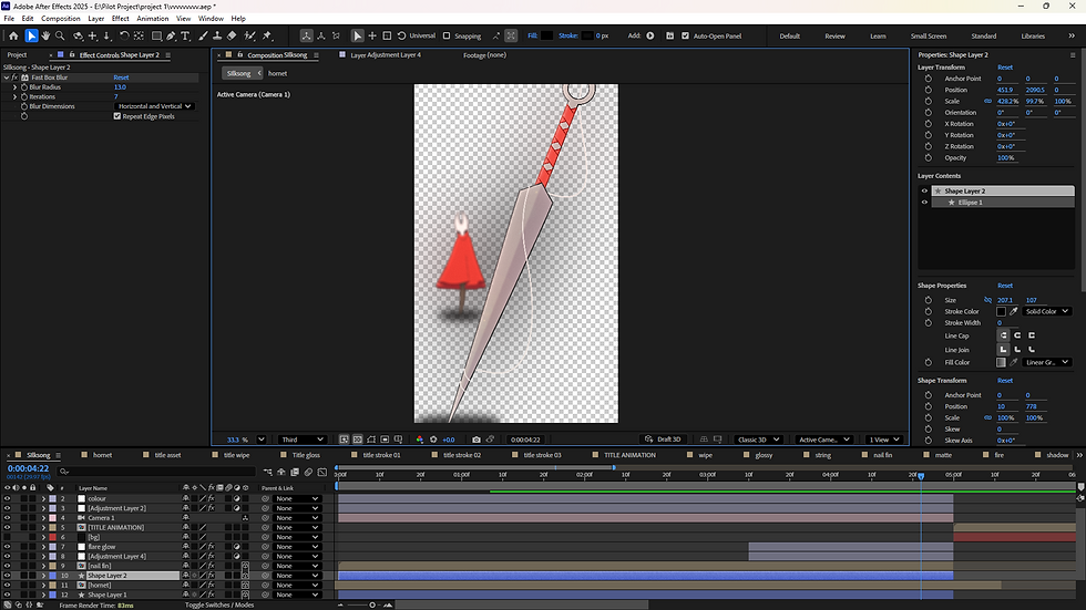
After some experimentation, I discovered the Lens Flare effect. I created a mask around the needle, applied the effect, then keyframed its position and adjusted the brightness settings until it felt just right.
In the end, I was surprised by how much this small detail elevated the scene. It reminded me that simplicity, when used thoughtfully, can often be far more impactful than complex ideas.


Backgrounds
From the beginning, I was quite against using fan artworks for my animation, as it felt wrong to use someone’s work without consent. After discussing some ideas with friends during one of my lectures, my friend’s partner kindly reached out and offered to take modded screenshots from within the game. We explored different areas together, and after some time, they sent me several great results.

I must admit, they really went above and beyond to help me, but sadly I didn’t end up using their screenshots for a few reasons. The images provided were 1920x1080p, which isn’t bad, but once I started zooming into the scene, the quality quickly became pixelated.

To fix this, I tried using AI upscaling, but the results turned out blurry and inconsistent.
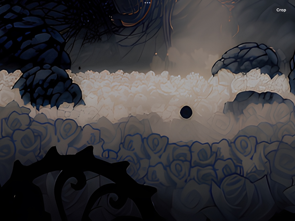
It was a tough decision, but in the end, I decided to use a 4K image of the game that I found online instead. I brought the image into Photoshop and used their AI tools to remove the character and UI from the scene, and then extended the background so it made sense within the context of the animation.


To my surprise, it worked really well! This whole process taught me a lot about adapting to technical limitations and finding creative solutions when things don’t go exactly as planned.
Detailing and Shadows
To add more depth and detail to the scene, I created shadow layers manually using the Ellipse tool to draw shapes underneath both Hornet and the nail. After lowering their opacity, I carefully adjusted their positions so the shadows remained consistent as the 3D camera moved through the space.
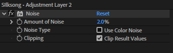
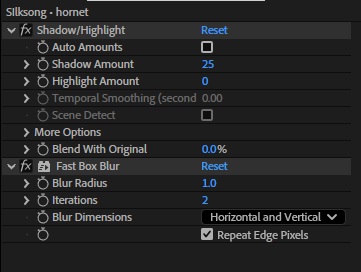
In addition to that, I created several adjustment layers to apply effects across the entire composition. My go-to effects included Shadow/Highlight, Fast Box Blur, Levels, Glow, Noise, and Lumetri Colour for colour correction. Each of these helped bring a greater sense of atmosphere and cohesion to the final piece. The shadows grounded the characters within the scene, the blur and glow effects softened transitions, and the colour correction tied everything together visually.
Looking back, I think these small finishing touches played a huge role in making the animation feel more polished and cinematic, showing how details can truly elevate the overall presentation.


Fire Particles
Following on the title sceen, yeah I gave up on my two original ideas. While rewatching the official trailer I got inspired from their title screen, and because I refused to take shortcuts, I have decided to recreate it entirely from scratch!

I began by creating a soft gradient using the Four-Color Gradient effect to establish the base colours of the scene. I then applied Fractal Noise and keyframed its evolution to create a gentle, wave-like motion in the distance. To help it blend more naturally with the gradient, I set the blending mode of the Fractal Noise layer to Classic.


Once I was happy with the background, I added the particles using the CC Particle World effect. I changed the particle type to Shaded Sphere and adjusted its axis, direction, birth rate, and gravity to achieve the desired movement. I spent some time experimenting with these settings until I found a look that felt just right.,

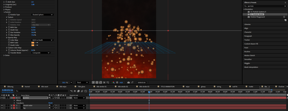

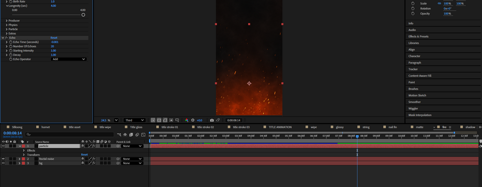
Finally, I applied a Glow effect to the particles and adjusted its intensity to make them stand out while adding a soft, atmospheric feel to the composition. I also added an Echo effect to the particles to make them appear closer to the original and give the motion a smoother, more cohesive look. Once everything was in place and I was happy with the result, I layered the title animation on top to complete the final scene.
Final Timeline

Music
Originally, I had planned to use a fan remake of the song I Can’t Stop The Loneliness by ANRI. The track had recently blown up on platforms like TikTok and Instagram, often being used in fan-made edits, and I thought it would be a fun idea to hop on that trend.
However, in the end, I decided to change the song for a few reasons. The main one was that it seemed to take attention away from the animation itself, at least according to some of the feedback I received from friends. One of them even mentioned that my animation looked too good to be a "meme".
While I genuinely appreciated that comment (and did enjoy the lighthearted feel of the original song), I eventually agreed that a different soundtrack would suit the tone better. I ended up using the Moss Grotto theme instead, which actually fits perfectly, especially since that’s the same area featured in the first shot of my animation. Looking back, I’m really glad I made that change, it helped the animation feel more cohesive and true to its atmosphere.
Once I had the song ready, I have assembed everything together in Adobe Premiere Pro, using the After Effects file for easier adjustment.

Final Outcome
Final Thoughts
Overall, I am absolutely blown away by the final outcome. This project took many twists and turns, but I don’t regret any of them. I truly took on a massively ambitious project for only a two-week production period, and while there are definitely things I wish I could’ve added or improved, I’m genuinely proud of what I managed to accomplish in such a short time.
I love the animation process - even though it can be frustrating at times (After Effects and I have a rather complicated relationship when it comes to crashes, but we’re still working on it).
Perhaps that’s just part of the creative struggle, but it doesn’t discourage me at all from continuing to create work I am passionate about. If anything, it only motivates me further. I hope this project reflects not only my love for the game and animation but also my dedication and excitement to keep growing as an artist.


Comments