Letterpress - Week 3
- Julia Toczyska
- Nov 2, 2023
- 2 min read

Updated: Feb 18, 2024
Artist Research
Before preparing to produce my own prints, I have decided to research the works of Alan Kitching in order to deepen my understanding of letter pressing and gain inspiration.

Alan Kitching
Alan Kitching is often mentioned to be known for sticking rigorously to wood and metal as a material of his choice. Kitching created highly evocative graphic images and displayed masterful command of typography within his work.
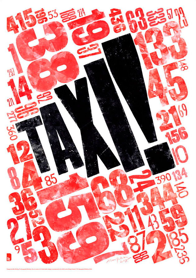
The London Poster Project
While viewing Kitching's work, I was particularly drawn to the 'London Poster Project,' part of the 2009 London Design Festival exhibition featuring twenty posters by the UK's most renowned graphic designers.
Each artist created a poster celebrating London as the 'creative capital of the world' using only red, black, and white and silk screening it in a limited edition of 100.
I love how Kitching playfully exaggerated 'taxi!' through spacing and contrasted colours and textures.
His work often includes bright colours, but limiting this poster to just black and red makes it more eye-catching, in my opinion, forcing viewers to pay close attention to intentional details. This limited palette showcases the exact reason why I enjoy black and white photography so much - restricted conditions make everything much more thought out.
In my opinion, Kitching did an excellent job sticking to the brief and yet still creating something that represents his skill and and signature style.
Letter Pressing
This week we learned the art of letterpress printing, in which words and letters are pressed into paper. For this project, we each chose a word from our manifesto to print. I selected "freedom" because it encapsulates the essence of our manifesto.


We learned about the letterpress process and components, and how to assemble our own presses. In the picture above, you can see my chosen word laid out and ready to print.
I used bold, confident letters to reflect our belief in true freedom. While composing the word, I highlighted "free" in a stair-step shape, intending for it to stand out as a metaphor that freedom should be available to all. The layout process was quite challenging because we had to apply enough pressure on the letters to prevent them from falling out. I found it easiest to keep the letters somewhat straight so that pressure could be applied from both sides.
My first letterpress print was a simple solid impression, but the ink did not transfer well. So on my second try, I pressed harder to create a sharper, more defined print.
Reflections
Overall, I am highly satisfied with my prints, especially with how bold and sharp my letters turned out. I found this experience new but at the same time extremely rewarding. One thing I wish I could experiment with next time is - colour, as well as layering text over each other.
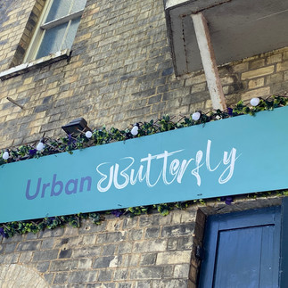
Typography Around Cambridge


Comments